Another exercise completed slightly out of sequence, but having read the brief, it didn’t seem critical to have completed the preceding exercises before tackling this, the final exercise in the first section of the course. The exercise involves selecting 3 previously created photographs and experimenting with various crops. As usual, you can click on any of the pictures below to see a large version.
Looking back through my recent pictures, it appears that I am a conservative cropper! There, I said it. While I will often crop pictures or shoot with a crop in mind, these crops tend to be traditional ratios of 3:2, 5:4 or square.
Cropping horizontally or vertically tends to follow the axis of the subject – for example, a standing figure is often positioned in an upright frame and for me at least, the frame tends to be tall and thin (3:2) to follow the proportions of the human body. Likewise, landscape shots will usually be shot, or cropped, to keep the horizon on the longer axis, as that is what our binocular, side-by-side eyes expect to see.
My previous dalliances with medium-format film cameras, such as Holgas, Bronicas and Lubitels, mean that I am comfortable with square crops. Reading Michael Freeman’s (strangely brief) description of square frames and his statements such as ‘it is the most difficult format to work with’ and ‘design strategies for a square frame are concerned with escaping the tyranny of its perfect equilibrium’ could be enough to put anyone off shooting in that format. But the explosion of Instagram particularly, means that the square frame is well and truly back and a high percentage of the images we see every day are now square. But it’s popularity doesn’t mean that it lends itself to every situation. It doesn’t suit dynamism. It is stable. Static. I like it.
Anyway, on to the exercise. My first picture was taken at the end of the runway of East Midlands Airport last Sunday night. My wife was arriving back from Poland on the 22.55 from Wrocław and I took the opportunity to take a few pictures while I waited. This is a 5’20” exposure and features the light trails of both her flight and the preceding one from Cork.
The first picture is the original, full-frame (3:2) aspect ratio. It was so dark that I struggled to compose properly and always intended to straighten and crop as required later. The square crop focuses attention on the subject. It keeps the frame ‘busy’ and removes much of the empty black space of the original. The lines of the aircraft lights and the cars passing in the foreground are complimented by the upright and angular light gantry, but contrast nicely with the radial ‘star-bursts’ caused by the tiny (f22) aperture. This crop also removes the ‘gap’ between the gantry and the hotel to the left which I didn’t like.
 The final crop is a ratio that I wouldn’t normally consider, but I feel that it works for this image. The framing contains enough of the sky and surroundings to show us how dark the night was. Apart from the silhouettes of the bushes, there is nothing natural in the image – everything is man made. Dynamism has been added to the image by the light trails in the foreground following the edge of the frame.
Unfortunately, as I’d focussed on the gantry in the centre of the frame, the hotel in the distant left is not sharp and lets the final picture down.
The second image was taken at the Nagar Kirtan in Leicester, also shot last Sunday. It’s a Sikh custom that involves a procession to sing hymns to the community. It started on East Park Road and took two and a half hours to make its way to Holy Bones at St Nicholas’ Circle. Along the way, Sewadars cleaned the streets with brooms ahead of the procession and at several points, the participants were fed samosas, bhajis and pizzas.
10,000 people were expected at what was a fantastically colourful event that was the most friendly gathering of it’s size that the city has seen for a while. This picture shows one of the ‘elders’ who walked barefoot alongside the parade. He, like many of the others was happy to have his picture taken.
The original image puts the subject into some context showing other people and one of the decorated floats carrying musicians. Due to the large aperture (f3.2) used however, the background becomes distracting rather than adding to the picture, particularly when in colour because of the hi-viz jackets (a blight on the streets of the nation). The portrait crop is better (and the conversion to black and white helps with the distractions) but isolates the individual too much. He was part of a huge crowd and so limiting the framing to just one man doesn’t make sense.
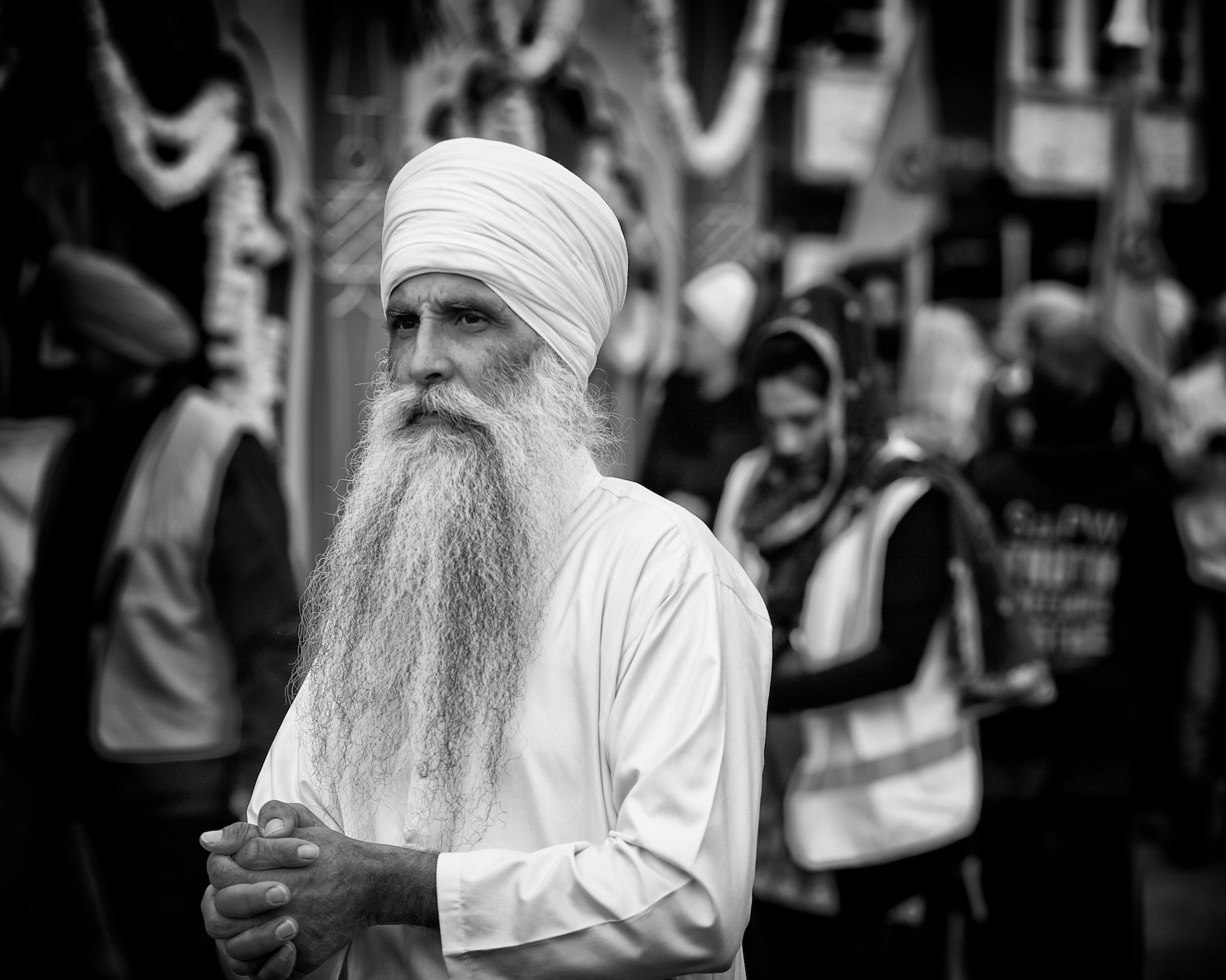 And so my chosen crop for this picture was a 5:4. It retains the attention on the subject but shows something of his surroundings. While he is surrounded by people, he remains, focussed, serene and calm.
You can see my other pictures from the Nagar Kirtan on Flickr.
The third picture was taken at a Grade 2 Listed petrol station near us, although it isn’t of the bit that English Heritage would be interested in, but rather the hand car wash that has appeared on the site. The original image was always going to be cropped. It is included on the left here but contains too much black sky. The first crop on the right concentrates the view onto the foreground and removes much of the black sky – I likes the lines of the drains and the hose, but was annoyed that the end of the fence and the lamppost weren’t parallel.
 The final crop centres on the chairs – the element that I found interesting in the first place. I included a little more of the left hand fence to lessen the effect of its lean. The final crop was then edited to remove all colour, stars and other distractions from the sky to give the impression of being cloudy and overcast. The contrast in the concrete was increased and a vignette added, again to enhance the ‘damp’ feel, the feeling I experienced when taking the picture. I guess they’d had a busy day in the car wash and no time to use the chairs…
An interesting exercise. Three pictures with three different final crop ratios that have taught me that I do need to experiment more with cropping. In the past, if I’d expected the picture to be printed, I’d have kept to the ‘standard’ aspect ratios because of available print and frame sizes. Now that most images are viewed on-line, it is less important to stick to these traditional ratios and pictures can be trimmed to give the best resultant image instead.
Reference: Freeman, M. (2007) The Photographer’s Eye: Composition and Design for Better Digital Photos. Lewes: The Ilex Press Limited.

[…] It was shot on medium format film using a Bronica and processed at home. The images share a square crop and a lack of […]
LikeLike
[…] point away in the distance. You can read about how ‘Intermittent’ came to be taken in my previous post on the cropping exercise. The post also explains why this crop was selected. I had taken pictures of landing aircraft from a […]
LikeLike