Over the last few weeks, I’ve received three excellent photography ‘zines that I’d like to tell you about…
They’re part of what feels like a movement over the last couple of years towards more people printing their photography, and that this resurgence may be a reaction to the temporary, transient nature of pictures posted online. While it’s possible for things to remain ‘up’ for many years, they can be taken ‘down’, either purposefully or accidentally, at any time and they’re gone forever. It seems that Instagram is the way that most people will consume their photography for the foreseeable future, and so the work that we consume will be at the mercy of an algorithm and will disappear as soon as we scroll past it.
I enjoy the idea of a book (or print), however modest, sitting on a bookshelf to be rediscovered years into the future, giving the opportunity to enjoy someone’s work once more – I don’t know how that happens on Instagram.
Further, a photozine or book allows the creator to sequence the pictures, choose a cover and paper stock and to tell a story or create a mood with their work; something that’s impossible when those pictures are being viewed in a ‘timeline’.
Also, in my opinion, photographs just look better when viewed as a reflective, physical thing and not backlit on a screen.
Blue Mosque – Julián Péter.
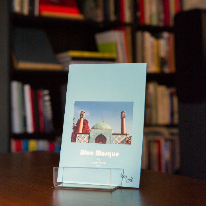
I met Julián on a trip to Hamburg in January. He’s a fellow film shooter, expatriate and human being, and for a youngster, has a very interesting life story. When we met, I gave him a couple of my zines and we talked about our shared love of the format. He talked about this work and his intention to release it as a small book and I offered some of my limited experience.
I’m lucky enough to have received copy #1 of 50, and it came with a beautiful, typewritten note – I bought a vintage typewriter immediately after receiving Julián’s letter. The work is true to many of the original zine values in that it’s A5, stapled and contains just 13 photographs across 16 pages. There is no text other than the title and Julián’s website address, meaning that attention is given only to the images. Unusually, it is printed on a blue background throughout, matching the colour of the eponymous mosque.
The zine was five years in the making as the film was shot on October 3rd, 2014; Germany’s Unity Day. Julián was new into Hamburg and took the opportunity to visit one of the country’s oldest mosques as it opened its doors to visitors. The Iranian Shias offered food, music and lectures before inviting onlookers to watch their prayer service; it sounds like the sort of event that is ever more vital in our current, confused times.
Most of the pictures were taken during the ceremony, from an upper level of the main, circular prayer room. They show the devoted on their colourful prayer mats in deep concentration, despite the presence of their guests. Some of the pictures give the slightly odd impression of the Islamic worshippers being looked down upon by the Europeans above.
Blue Mosque is a zine as it should be. Simple, cheap and without distractions to take away from the content. It can be shared, swapped and saved away for rediscovery in years to come…
4 Stops – Volume 1, Architecture and Signage.
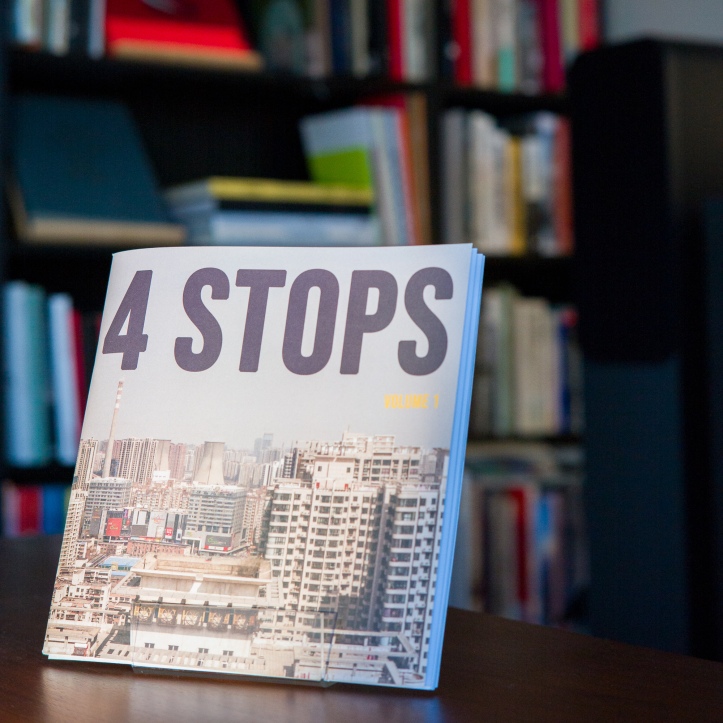
By contrast, 4 Stops (Volume 1) is a 210mm (that’s the width of an A4 page) square book of 40 heavyweight pages and a thick, tactile, matt cover. It arrived with prints, stickers and a thank you note; the high production values made an excellent first impression. It’s a collaborative effort from four photographers from around the world (the UK, Hong Kong, the USA and Australia) that has been put together by Ben Mills as part of his Hip Shoot Film project.
The zine collects pictures from each of the photographers, based on the themes of signage and architecture and happily mixes film stocks, resulting in both colour and black and white photographs. Page layouts are also varied, including single images, pairs and full-bleed spreads.
Despite this variety, what holds the zine together are the pairings and sequencing of the pictures. Sometimes it’s the subject matter that is presented with similar objects from different continents and on other occasions, it’s the composition that is shared across the pair. In a few instances, it’s a juxtaposition of dissimilar elements.
As you read the magazine, you begin to play ‘guess the country’, looking for clues as to which of the photographers contributed each image. It’s interesting that to me, the UK pictures from Ben seem familiar and mundane, but the pictures from elsewhere of the same subject matter appear exotic. I imagine that the reverse is true and readers in Hong Kong, the USA and Australia will think the reverse and marvel at the Vauxhall Astra parked outside the council houses.
I also wondered how the project had worked. Did each of the four submit a large quantity of pictures that Ben edited down to make sense as a final cut? Or, perhaps Ben produced a set of pictures and sent them out for a response from the others. (I’ve answered Ben’s invite to get involved in a future 4 Stops project, so perhaps I can find out…).
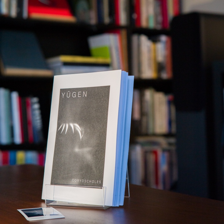
Yūgen – Cory D Scholes.
Cory is a friend of mine from back home in Leicester. Before I emigrated, we used to get together every couple of months to go out and shoot before heading for the pub for a drunken conversation about music, photobooks, Britain’s self-destructive exit from the European Union and how shit it was to get old.
Until recently, his Twitter bio described him as an ‘undiscovered genius’ which may or may not be true. He is however, one of my favourite photographers.
Cory’s latest zine is Yūgen. Yūgen is defined in the opening pages as ‘a profound, mysterious sense of the beauty of the universe…. and the sad beauty of human suffering’.
The edition of 30 copies has perhaps the lowest ‘production values’ of the three releases here. Again, it is printed at A5 size, it’s 32 pages are all black and white, with a rough, natural feel.
Right from the off, the graphic, bold, black and white images build on the mood of that opening definition of the title. The straightforward layout presents each image ‘front and centre’ with no distractions.
Cory is a fellow photobook geek and it shows in this work. The pairings and pacing here are brilliant. Each spread needs a varying degree of effort to understand why the pictures have been presented side by side and why they fit with the others, but once you ‘get it’, it seems obvious and adds to the narrative. It’s a cumulative effect and doesn’t let up. Once you’ve got to the end, you’ll flick back to the start and look again and it’ll all make more sense with each viewing.
If this all seems like hard work, don’t worry, there are great individual images too.
I’d love to see this work as a huge, high quality, ‘coffee-table’ photobook. However, the problem with photobooks and reason that zines are so potentially powerful is that a book would cost a lot of money and so only ever be seen by a limited number of people. The idea that a zine can cost just a few euro/pounds/dollars and be posted around the world makes it an inclusive, egalitarian way to share art.
For this reader, this is close to the perfect zine. It’s the right size, has the right amount of pictures, and doesn’t have any distractions from the images that it presents. The work is extremely consistent, both in quality and mood, and it’s a lesson to those of us who aspire to create consistent, cohesive output rather than just craftsmen, creating decent, one-off pictures.
Check out each of the authors at the following links:
Julián – julopeter.com
Ben (Hip Shoot Film) – hipshootfilm.com
Cory – corydscholesphotography.co.uk

Some good stuff on Julian’s and Cory’s websites.
LikeLiked by 1 person
How do you get these (or any) zines?
LikeLiked by 1 person
All of these guys are on Twitter, and their websites are listed at the bottom of the page. Give them each a shout.
LikeLiked by 1 person
Thanks. Just went down a photo zine rabbit hole and ordered several.
LikeLiked by 1 person
These all look great, particularly the last one. Would you be interested in reviewing a poetry art zine, or do you only cover photography?
LikeLiked by 1 person
Hi. Thanks for reading. I’d be happy to have a go
LikeLiked by 1 person
That’s great – thank you! What’s the best way to contact you?
LikeLike
Hi – there’s a few ways to contact me on my ‘about’ page. Let me know if none of them work for you… https://barnabynutt.com/about/
LikeLiked by 1 person
Thank you – I’ve sent you a FB message.
LikeLike
Helloo nice blog
LikeLiked by 1 person